Cover art is up - Orb, Sceptre, Throne
#41

Posted 08 September 2011 - 03:40 PM
Wow. So boring. Hayden Christenson is the Hope or the Tyrant?
Buddhacat
#42

Posted 08 September 2011 - 05:18 PM
I like it.
I don't see the problem.
It's gonna look shiny and awesome next to my other ICE hardcovers.

I don't see the problem.
It's gonna look shiny and awesome next to my other ICE hardcovers.
"When the last tree has fallen, and the rivers are poisoned, you cannot eat money, oh no." ~Aurora
Someone will always try to sell you despair, just so they don't feel alone. ~Ursula Vernon
Someone will always try to sell you despair, just so they don't feel alone. ~Ursula Vernon
#43

Posted 08 September 2011 - 08:34 PM
In Dust of Dreams, Fiddler's reading named (marked according to Fid) Grub as Scepter. Not sure of the timeline of this Darujhistan book, but if after TCG, be interesting if it was Grub.
"Yes, the owl was deliberate in each and every instance, and yes, it was intended to work on multiple levels." (from SE's Dec 09 Q&A)
#44

Posted 09 September 2011 - 12:42 AM
 ShadowOwl, on 08 September 2011 - 08:34 PM, said:
In Dust of Dreams, Fiddler's reading named (marked according to Fid) Grub as Scepter. Not sure of the timeline of this Darujhistan book, but if after TCG, be interesting if it was Grub.
well it could be. apparently time moves quicker in darujhistan (harllo is how old??)
There's a fine line between genius and insanity. I have erased this line.
- Oscar Levant
- Oscar Levant
#45

Posted 09 September 2011 - 01:09 AM
Can we PLEASE boot Steve Stone from the Malazan series? It's pretty obvious that he doesn't put any effort on these covers anymore.
I thought that Mark C. Newton covers were bad enough already, I didn't expect the blight to take over Malazan as well. It should be the other way around, good artists becoming more and more prevalent.
Instead we have this photo + moody background becoming prevalent. Covers that make the best effort possible to hide Malazan books amidst the indistinguishable sea of crap of urban fantasy.
This post has been edited by Abalieno: 09 September 2011 - 01:11 AM
#MrSkimpole
Feed then or perish. Life is but a search for gardens and gentle refuge, and here I sit waging the sweetest war, for I shall not die while a single tale remains to be told. Even the gods must wait spellbound.
Crack'd Pot Trail
Feed then or perish. Life is but a search for gardens and gentle refuge, and here I sit waging the sweetest war, for I shall not die while a single tale remains to be told. Even the gods must wait spellbound.
Crack'd Pot Trail
#46

Posted 09 September 2011 - 01:17 AM
 Sombra, on 08 September 2011 - 09:24 AM, said:
Speaking of which, it could have been done by that dude who did all those ghastly WoT covers. So we can at least be grateful for that. 
I'd take Darrell Sweet any day over this shitty trend of collage of photo of guy + computer generated background + shifted color palette.
Steve Stone must feel very accomplished being able to hack book covers in half an hour for the same pay of before.
At least Darrell Sweet painted the covers himself.
#MrSkimpole
Feed then or perish. Life is but a search for gardens and gentle refuge, and here I sit waging the sweetest war, for I shall not die while a single tale remains to be told. Even the gods must wait spellbound.
Crack'd Pot Trail
Feed then or perish. Life is but a search for gardens and gentle refuge, and here I sit waging the sweetest war, for I shall not die while a single tale remains to be told. Even the gods must wait spellbound.
Crack'd Pot Trail
#47

Posted 09 September 2011 - 07:40 AM
While Im not a fan of all of Darrel K. Sweets covers for WOT, they look way more classy than this. Certainly a lot more effort is put into them. I would never have started reading that series if the early covers werent as alluring as they are(I love WOT by the way).
#48

Posted 09 September 2011 - 08:15 AM
 Sinisdar Toste, on 07 September 2011 - 10:37 PM, said:
darujhistan at least looks nice. but it is terribly similar to the CG cover.
i think if the swordsman turns out to be a central character, say, one of the noms, then i will forgive the cheesy-ness. also, orb, sceptre, throne is sounding less clunky, but maybe that's just familiarity. i wonder if the title is symbolic or literal...
i think if the swordsman turns out to be a central character, say, one of the noms, then i will forgive the cheesy-ness. also, orb, sceptre, throne is sounding less clunky, but maybe that's just familiarity. i wonder if the title is symbolic or literal...
I never thought it sounded clunky at all. It confuses me why some people do. Orb, Sceptre, Throne... just three short words, sounds Malazan Empire-ish. Well, we haven't seen a whole lot of sceptres, but the Imperial symbol is an orb gripped by a demon hand, and we've certainly seen or heard about thrones a lot in the two series.
Laseen did nothing wrong.
I demand Telorast & Curdle plushies.
I demand Telorast & Curdle plushies.
#49

Posted 09 September 2011 - 08:16 AM
 Khellendros, on 07 September 2011 - 10:25 PM, said:
Where's the freaking ship dammit?! If I squint real hard I can just about make one out in the background...not nearly good enough! Don't they want people to know that this is a series about naval warfare and ship parades?
As for the man....Bellam Nom sounds like a good fit if we are making up someone for the generic man in foreground. Or, Murillio Resurrected! Dun dun dun!
As for the man....Bellam Nom sounds like a good fit if we are making up someone for the generic man in foreground. Or, Murillio Resurrected! Dun dun dun!
I'm not sure if you're being sarcastic or not.
Going with "not," I agree. I want a bigass ship on the covers of my ICE novels.
Laseen did nothing wrong.
I demand Telorast & Curdle plushies.
I demand Telorast & Curdle plushies.
#50

Posted 09 September 2011 - 08:42 AM
 Kanese S, on 09 September 2011 - 08:15 AM, said:
 Sinisdar Toste, on 07 September 2011 - 10:37 PM, said:
darujhistan at least looks nice. but it is terribly similar to the CG cover.
i think if the swordsman turns out to be a central character, say, one of the noms, then i will forgive the cheesy-ness. also, orb, sceptre, throne is sounding less clunky, but maybe that's just familiarity. i wonder if the title is symbolic or literal...
i think if the swordsman turns out to be a central character, say, one of the noms, then i will forgive the cheesy-ness. also, orb, sceptre, throne is sounding less clunky, but maybe that's just familiarity. i wonder if the title is symbolic or literal...
I never thought it sounded clunky at all. It confuses me why some people do. Orb, Sceptre, Throne... just three short words, sounds Malazan Empire-ish. Well, we haven't seen a whole lot of sceptres, but the Imperial symbol is an orb gripped by a demon hand, and we've certainly seen or heard about thrones a lot in the two series.
I feel the same. It basically promises that three of the most interesting cards in the Deck will somehow feature. It's give me little fanboy shivers of excitement.
I've always like that most of the Malazan novels don't have boring cliched fantasy titles. Gardens of the Moon, House of Chains, Memories of Ice, Toll the Hounds - it was one of the things that drew my eye to them on the shelf. I can forgive 'The Crippled God' because the title was kinda.. necessary.
Captain of Team Quick Ben. Also teaboy.
#51

Posted 09 September 2011 - 08:58 AM
 Abalieno, on 09 September 2011 - 01:17 AM, said:
I'd take Darrell Sweet any day over this shitty trend of collage of photo of guy + computer generated background + shifted color palette.Steve Stone must feel very accomplished being able to hack book covers in half an hour for the same pay of before.At least Darrell Sweet painted the covers himself.
Who gives a shit if he painted them or did it in macrame? All that matters is how it looks.
 Asharak, on 09 September 2011 - 07:40 AM, said:
While Im not a fan of all of Darrel K. Sweets covers for WOT, they look way more classy than this. Certainly a lot more effort is put into them. I would never have started reading that series if the early covers werent as alluring as they are(I love WOT by the way).
Guys, take a look at Wert's little lineup here:
http://thewertzone.b...off-part-1.html
and
http://thewertzone.b...off-part-2.html
Sweet had a couple of good ones, but overall they're quite shit. I thought so at the time as they came out (the Eye of the World cover didn't grab me in 1990 - the fact it was a new fantasy book in a small regional town did) and in comparison with most of the new covers, his really, REALLY suffer.
No matter how you feel about the artistic process, the Malazan book covers get off quite lightly by comparison. I mean, have you SEEN that cover for The Gathering Storm? *puke*
Personally, I'd love to have Komarck do them all, and illustrate every page as I couldn't give a shit about the medium he uses merely the fact his work is the BEST out there by miles. Oh well, maybe when I win that $100,000,000...
"Fortune favors the bold, though statistics favor the cautious." - Indomitable Courteous (Icy) Fist, The Palace Job - Patrick Weekes
"Well well well ... if it ain't The Invisible C**t." - Billy Butcher, The Boys
"I have strong views about not tempting providence and, as a wise man once said, the difference between luck and a wheelbarrow is, luck doesnt work if you push it." - Colonel Orhan, Sixteen Ways to Defend a Walled City - KJ Parker
#52

Posted 09 September 2011 - 09:54 AM
I read this book because of this cover and Im
not ashamed about that.
stunning stuff.
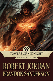
Imagine an image like this of
Caladan brood at the forge shattering swords...
goose bumps right?
not ashamed about that.
stunning stuff.

Imagine an image like this of
Caladan brood at the forge shattering swords...
goose bumps right?
Behind this mask there is more than just flesh. Beneath this mask there is an idea... and ideas are bulletproof Gas-Fireproof.
#53

Posted 09 September 2011 - 10:25 AM
This looks like Raymond Swanland.. I'd die to see Swanland doing the Malazan covers.
For once, the German publisher of the MBotF is doing a more decent job than the UK one, as they are using covers Swanland did for other series' (like The Black Company) for the MBotF. It does catch the atmosphere nicely.
For once, the German publisher of the MBotF is doing a more decent job than the UK one, as they are using covers Swanland did for other series' (like The Black Company) for the MBotF. It does catch the atmosphere nicely.
This post has been edited by Robin Goodfellow: 09 September 2011 - 10:28 AM
Puck was not birthed, she was cleaved from a lava flow and shaped by a fierce god's hands. - [worry]
Ninja Puck, Ninja Puck, really doesn't give a fuck..? - [King Lear]
Ninja Puck, Ninja Puck, really doesn't give a fuck..? - [King Lear]
#54

Posted 09 September 2011 - 10:52 AM
You know I saw those a couple of hours ago.
Its weird that Glen Cook okayed that.
Is there some relationship between the
two authors that I'm not aware of?
Either way Swanland is a good look for any
fantasy title.
Its weird that Glen Cook okayed that.
Is there some relationship between the
two authors that I'm not aware of?
Either way Swanland is a good look for any
fantasy title.
Behind this mask there is more than just flesh. Beneath this mask there is an idea... and ideas are bulletproof Gas-Fireproof.
#55

Posted 09 September 2011 - 02:01 PM
 Kanese S, on 09 September 2011 - 08:15 AM, said:
 Sinisdar Toste, on 07 September 2011 - 10:37 PM, said:
darujhistan at least looks nice. but it is terribly similar to the CG cover.
i think if the swordsman turns out to be a central character, say, one of the noms, then i will forgive the cheesy-ness. also, orb, sceptre, throne is sounding less clunky, but maybe that's just familiarity. i wonder if the title is symbolic or literal...
i think if the swordsman turns out to be a central character, say, one of the noms, then i will forgive the cheesy-ness. also, orb, sceptre, throne is sounding less clunky, but maybe that's just familiarity. i wonder if the title is symbolic or literal...
I never thought it sounded clunky at all. It confuses me why some people do. Orb, Sceptre, Throne... just three short words, sounds Malazan Empire-ish. Well, we haven't seen a whole lot of sceptres, but the Imperial symbol is an orb gripped by a demon hand, and we've certainly seen or heard about thrones a lot in the two series.
Actually, there's a significant ref to a 'sceptre' in the TCG prologue.
Check the
Spoiler
appearance, right at the end of it. Dolmen, on 09 September 2011 - 10:52 AM, said:
You know I saw those a couple of hours ago.
Its weird that Glen Cook okayed that.
Is there some relationship between the
two authors that I'm not aware of?
....
Its weird that Glen Cook okayed that.
Is there some relationship between the
two authors that I'm not aware of?
....
I have no idea whether they're close buds, but SE has mentioned Cook's Black Company as one of his influences more than once.
THIS IS YOUR REMINDER THAT THERE IS A
'VIEW NEW CONTENT' BUTTON THAT
ALLOWS YOU TO VIEW NEW CONTENT
'VIEW NEW CONTENT' BUTTON THAT
ALLOWS YOU TO VIEW NEW CONTENT
#56

Posted 09 September 2011 - 02:11 PM
 Abalieno, on 09 September 2011 - 01:17 AM, said:
 Sombra, on 08 September 2011 - 09:24 AM, said:
Speaking of which, it could have been done by that dude who did all those ghastly WoT covers. So we can at least be grateful for that. 
I'd take Darrell Sweet any day over this shitty trend of collage of photo of guy + computer generated background + shifted color palette.
Steve Stone must feel very accomplished being able to hack book covers in half an hour for the same pay of before.
At least Darrell Sweet painted the covers himself.
I'm going to simply assume that you know nothing about Photoshop and the work that likely goes into Steve Stone's covers. His covers likely take him weeks to get right. I'm sick and effing tired of folks thinking that photoshopping is easy. It's not. I use it for a living and sometimes even the smallest area can take hours to get right. In fact, I fully feel that painting (as long as you have the artistic skill) is easier than assembling, layering, colouring, lighting, cloning, brushing, tinting Photoshop work like the Stone covers. You don't like the covers, that's fine, but to say that he could bang them out in a half hour just shows that you know zip about he program he uses to make them, and really supports a theory that REAL Photoshop work is easy, so I'll thank you not to make light of a tough job.
I also feel that I should say that the photoshopped covers are trying to bring a realism to the genre that hasn't existed until recently. One of the main reasons people overlook fantasy and sci-fi and get on the genre's case is that for years it was a very cartooney place to be. The shelves were covered with comic book style art that lead regular folk to believe that the genre was expressly the domain of kids and uber-nerds. I for one am a big fan of trying to stem that flow and at least bring a bit of realism to the characters (if that is what they choose to represent on the covers).
Take Abercrombie's books. The normal covers are some of my faves, scroll-like maps or books, burning or covered in blood spatter ect. They are stunning and look great on the shelf. However, when they commissioned the real character covers for the MMP....all 3 looked pretty damn close to how I pictured the characters looking (Logen, Glokta, and Jezal) and so I actually really enjoyed those.
"When the last tree has fallen, and the rivers are poisoned, you cannot eat money, oh no." ~Aurora
Someone will always try to sell you despair, just so they don't feel alone. ~Ursula Vernon
Someone will always try to sell you despair, just so they don't feel alone. ~Ursula Vernon
#57

Posted 09 September 2011 - 02:55 PM
I agree with Dolmen and Puck, honestly the Black Company Anthology covers are some of the best illustrations I've seen on a book. Ever. The Jordan one Dolmen put up (evidently by the same person) is just as awesome.
Edit - Abercrombies first trilogy covers were nifty, but they certainly didn't blow me away.
Edit - Abercrombies first trilogy covers were nifty, but they certainly didn't blow me away.
This post has been edited by Dutch Flag: 09 September 2011 - 03:08 PM
Monster Hunter World Iceborne: It's like hunting monsters, but on crack, but the monsters are also on crack.
#58

Posted 09 September 2011 - 03:15 PM
 QuickTidal, on 09 September 2011 - 02:11 PM, said:
I'm going to simply assume that you know nothing about Photoshop and the work that likely goes into Steve Stone's covers. His covers likely take him weeks to get right. I'm sick and effing tired of folks thinking that photoshopping is easy. It's not. I use it for a living and sometimes even the smallest area can take hours to get right. In fact, I fully feel that painting (as long as you have the artistic skill) is easier than assembling, layering, colouring, lighting, cloning, brushing, tinting Photoshop work like the Stone covers. You don't like the covers, that's fine, but to say that he could bang them out in a half hour just shows that you know zip about he program he uses to make them, and really supports a theory that REAL Photoshop work is easy, so I'll thank you not to make light of a tough job.
You see, I also use PS on a daily basis, for work and uni, and frankly, if this up there took Steve Stone weeks than he had to learn the program from scratch first. Fooling around trying to hide cutting edges with orange mist is not a stellar job. It's the first thing one learns NOT to do, if there's any way around it.
 QuickTidal, on 09 September 2011 - 02:11 PM, said:
I also feel that I should say that the photoshopped covers are trying to bring a realism to the genre that hasn't existed until recently. One of the main reasons people overlook fantasy and sci-fi and get on the genre's case is that for years it was a very cartooney place to be. The shelves were covered with comic book style art that lead regular folk to believe that the genre was expressly the domain of kids and uber-nerds. I for one am a big fan of trying to stem that flow and at least bring a bit of realism to the characters (if that is what they choose to represent on the covers).
And that's where we strongly disagree, as I don't think fantasy and visual realism go well together. I doubt elephants that are made out to be dragons will attract more non-nerdy people to read fantasy. You can't photomanipulate what does not exist and when you try it looks ridiculous. Painting allows you to do things that do not exist.
 QuickTidal, on 09 September 2011 - 02:11 PM, said:
Take Abercrombie's books. The normal covers are some of my faves, scroll-like maps or books, burning or covered in blood spatter ect. They are stunning and look great on the shelf. However, when they commissioned the real character covers for the MMP....all 3 looked pretty damn close to how I pictured the characters looking (Logen, Glokta, and Jezal) and so I actually really enjoyed those.
We're talking two different things here. Manipulating a map into looking like a scroll with a few custom brushed blood spatters is not the same as building a whole scenery.
And actually, I do like the comissioned new covers, too, but I do so not because they depict the characters as I imagined them but because they are well done. The latest covers Stone did for malazan [and other series', while we're at it] are not.
Puck was not birthed, she was cleaved from a lava flow and shaped by a fierce god's hands. - [worry]
Ninja Puck, Ninja Puck, really doesn't give a fuck..? - [King Lear]
Ninja Puck, Ninja Puck, really doesn't give a fuck..? - [King Lear]
#59

Posted 09 September 2011 - 03:16 PM
'dude with sword in front of background' is right up there with 'chick in bikini with sword' for lack of effort, not on the artist's part, but on the publishers for given even a shred of thought to how a book should be presented.
THIS IS YOUR REMINDER THAT THERE IS A
'VIEW NEW CONTENT' BUTTON THAT
ALLOWS YOU TO VIEW NEW CONTENT
'VIEW NEW CONTENT' BUTTON THAT
ALLOWS YOU TO VIEW NEW CONTENT
#60

Posted 09 September 2011 - 04:50 PM
Can't say I'm a fan. I need me a big ship dominating the covers of my Esslemont novels.
Also, purple and yellow? Because blue and orange is so 2009?
Also, purple and yellow? Because blue and orange is so 2009?
"Here is light. You will say that it is not a living entity, but you miss the point that it is more, not less. Without occupying space, it fills the universe. It nourishes everything, yet itself feeds upon destruction. We claim to control it, but does it not perhaps cultivate us as a source of food? May it not be that all wood grows so that it can be set ablaze, and that men and women are born to kindle fires?"
―Gene Wolfe, The Citadel of the Autarch
―Gene Wolfe, The Citadel of the Autarch

 Help
Help

