Posted 17 November 2013 - 02:12 PM
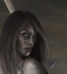
I agree. I like everything about the image (the pose, the attire, especially all the small details, the hair, etc.), except the face.. She's too.. pretty, I guess. She looks like someone gave her a professional make-up and styling (which is probably due to the referrence you used?). Also, she's supposed to have mouse-grey hair, so maybe you could change the hair colour? And the lips, I think different lips could give her a more Tavore-like feeling? Oh, and I assume you wanted to give her a somewhat tired/plain look, but the stuff around her eyes looks like make-up. You could make it less crassly different from her skin colour and remove some of it above the eyes and leave more towards the inner part of the face than the outer part. Same goes for the shadows beneath the eyes.
Those are details, though, and I really like the overall image. As for the background, you could try a stylized claw-pattern. Or bones.
Puck was not birthed, she was cleaved from a lava flow and shaped by a fierce god's hands. - [worry]
Ninja Puck, Ninja Puck, really doesn't give a fuck..? - [King Lear]
 mock's-hold2-SMALL-ADJ.jpg (335.11K)

 Help
Help


