 Help
Help
All help will be greatly appreciated - 1st prize is a free Bridgeburner t-shirt with your design on it
 Maybe we can do better than that, but it would still be a sweet prize.
 Hetan
Hetan 
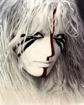

Posted 29 March 2010 - 12:54 PM
Maybe we can do better than that, but it would still be a sweet prize.
ashbury

Posted 29 March 2010 - 06:19 PM
 Hetan, on 29 March 2010 - 12:54 PM, said:
Maybe we can do better than that, but it would still be a sweet prize.
Hetan
Posted 29 March 2010 - 08:04 PM
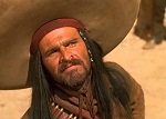
Defiance

Posted 29 March 2010 - 11:29 PM
ashbury
Posted 30 March 2010 - 06:49 AM
Hetan, on 29 March 2010 - 08:04 PM, said:
Hetan
Posted 30 March 2010 - 07:41 AM
 Badco.jpg (30.51K)
 )
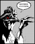
Gathras
)
Gathras

Posted 31 March 2010 - 07:40 AM
 Tsundoku
Posted 31 March 2010 - 07:41 AM
This post has been edited by Sombra: 31 March 2010 - 07:44 AM
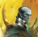
caladanbrood

Posted 31 March 2010 - 06:51 PM
 bb2.png (658.59K)
This post has been edited by caladanbrood: 31 March 2010 - 06:55 PM
Gathras
Posted 02 April 2010 - 11:03 AM
DSC01103.JPG (76.8K)
Puck

Posted 02 April 2010 - 04:25 PM
 caladanbrood
Posted 20 April 2010 - 04:36 PM
 Illuyankas
Posted 20 April 2010 - 04:42 PM
Tsundoku
Posted 20 April 2010 - 05:04 PM

This post has been edited by Sombra: 20 April 2010 - 05:07 PM
Obdigore

Posted 20 April 2010 - 05:20 PM
Hetan
Posted 20 April 2010 - 06:14 PM
 (it looked little on my pc!)
bridgeburnnerweb02.jpg (65.84K)
Tapper
(it looked little on my pc!)
bridgeburnnerweb02.jpg (65.84K)
Tapper
Posted 20 April 2010 - 08:59 PM
Tsundoku
Posted 21 April 2010 - 12:21 AM

This post has been edited by Sombra: 21 April 2010 - 01:16 AM
Ulrik
Posted 21 April 2010 - 05:49 AM
caladanbrood
Posted 21 April 2010 - 10:37 AM


