 Help
Help
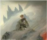
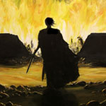
What do you think about the paperback cover for The Bonehunters?
http://ec2.images-amazon.com/images/P/0553..._V45181860_.jpg
The cover for the paperback
#2
 Folken

- Never throw your life away so easily
-

- Group: Malaz Regular
- Posts: 2,908
- Joined: 11-September 04
- Location:Toronto, Ontario, Canada
Posted 03 February 2007 - 05:33 PM
...
...
*goes off to burn bantam*
...
*goes off to burn bantam*
<div align='center'>You must always strive to be the best, but you must never believe that you are - Juan Manuel Fangio</div>
#3
Illuyankas
- Retro Classic
-
- Group: The Hateocracy of Truth
- Posts: 7,254
- Joined: 28-September 04
- Will cluck you up
Posted 03 February 2007 - 05:37 PM
I've seen worse. At least it's purposefully vague, and it's a hell of a lot better than the hardback.
Hello, soldiers, look at your mage, now back to me, now back at your mage, now back to me. Sadly, he isnt me, but if he stopped being an unascended mortal and switched to Sole Spice, he could smell like hes me. Look down, back up, where are you? Youre in a warren with the High Mage your cadre mage could smell like. Whats in your hand, back at me. I have it, its an acorn with two gates to that realm you love. Look again, the acorn is now otataral. Anything is possible when your mage smells like Sole Spice and not a Bole brother. Im on a quorl.
#4
Reborn

- Captain
-
- Group: Malaz Regular
- Posts: 160
- Joined: 21-September 06
- Location:Sweden
Posted 03 February 2007 - 05:38 PM
I really prefer this one before the one on the hardcover -- too bad I already own the book -- but I wonder why they changed it as they haven't done so before. Do you think it was because of complaints regarding the cover on the hardcover?
#5
Dolorous Menhir

- God
-
- Group: Wiki Contributor
- Posts: 4,550
- Joined: 31-January 06
Posted 03 February 2007 - 06:04 PM
Makes the series look like generic fantasy tosh.
Not that the original cover was any better in that respect. I mean, a guy with knives. Gee-whiz. No-one's going to walk past that in a store and stop to leaf through it.
Not that the original cover was any better in that respect. I mean, a guy with knives. Gee-whiz. No-one's going to walk past that in a store and stop to leaf through it.
#6
polishgenius
- Heart of Courage
-

- Group: LHTEC
- Posts: 5,324
- Joined: 16-June 05
Posted 03 February 2007 - 07:23 PM
I prefer the old one, just, because even though it was a bit generic this one looks nothing like the others. Unless they're re-covering all of them, which is irritating when it happens mid-series...
I can't carry it for you, but I can carry you.
#7
caladanbrood

- Ugly on the Inside
-

- Group: Team Quick Ben
- Posts: 10,819
- Joined: 07-January 03
- Location:Manchester, UK
Posted 03 February 2007 - 07:33 PM
They've finally given up on the usual title-style then? Thats a shame. Thats a horrible cover, and a big let-down:(
O xein', angellein Lakedaimoniois hoti têde; keimetha tois keinon rhémasi peithomenoi.
#8
Folken
- Never throw your life away so easily
-
- Group: Malaz Regular
- Posts: 2,908
- Joined: 11-September 04
- Location:Toronto, Ontario, Canada
Posted 04 February 2007 - 12:42 AM
Reborn;155833 said:
I really prefer this one before the one on the hardcover -- too bad I already own the book -- but I wonder why they changed it as they haven't done so before. Do you think it was because of complaints regarding the cover on the hardcover?
no complaints were lodged to the publisher per say...however the only complaint most of us had was that they had removed the Malazan font and what not. The cover was pretty awesome imo. However they're redoing the covers of all the novels, you should see new covers soon enough for the other novels as well if I remember (and interpreted) correctly.
*returns to burning bantam*
<div align='center'>You must always strive to be the best, but you must never believe that you are - Juan Manuel Fangio</div>
#9
Tattooed Hand
- High Fist
-
- Group: Malaz Regular
- Posts: 369
- Joined: 28-February 06
- Location:Berlin
Posted 04 February 2007 - 04:15 AM
They are both pretty lame, but for different reasons. The original was just cheesy. Kalam (I presume) looked like a mouth breathing knuckle dragger.
And this person looks like a performer about to rip his clothes off and do a dance number complete with dry ice.
And this person looks like a performer about to rip his clothes off and do a dance number complete with dry ice.
#10
Folken
- Never throw your life away so easily
-
- Group: Malaz Regular
- Posts: 2,908
- Joined: 11-September 04
- Location:Toronto, Ontario, Canada
Posted 04 February 2007 - 05:11 AM
looks more like a kid with shiny knives...*continues burning the rooster*
<div align='center'>You must always strive to be the best, but you must never believe that you are - Juan Manuel Fangio</div>
#11
Kurt Montandon
- First Sword
-

- Group: High House Mafia
- Posts: 571
- Joined: 17-May 05
- Location:California
Posted 04 February 2007 - 08:18 AM
Jen said:
looks more like a kid with shiny knives...*continues burning the rooster*
In all fairness, that's a not-too-inaccurate description of Apsalar.
Really, it just looks too CGI, like that hideous cover to A Civil Campaign by Lois McMaster Bujold, and many David Weber/John Ringo covers.
#12
Bl1nder

- Fist
-
- Group: Malaz Regular
- Posts: 289
- Joined: 09-November 06
Posted 04 February 2007 - 02:12 PM
Prefer it to the one I got, mostly because I was very dissapointed in the way Kalam was done
I have stolen princesses from sleeping barrow kings
I have burned the town of Trebon
I have spent the night with Felurian and left with both my sanity and my life
I was expelled from the University at a younger age most people are allowed in
I tread paths by moonlight that others fear to speak of during the day
I have talked to Gods, loved women, and written songs that make minstrels cry
You may have heard of me....
#13
Battalion

- Emperor
-
- Group: Malaz Regular
- Posts: 843
- Joined: 10-January 07
Posted 05 February 2007 - 12:33 PM
I couldn't agree more. The Kalam in the first one was dreadful, in my view. Realy dreadful. The new one is okay, that is better, I think, but it is kind of out of sorts with the earlier ones.
Still think Mightnight Tides was the best.
Still think Mightnight Tides was the best.
Get to the chopper!
#14
Folken
- Never throw your life away so easily
-
- Group: Malaz Regular
- Posts: 2,908
- Joined: 11-September 04
- Location:Toronto, Ontario, Canada
Posted 05 February 2007 - 12:47 PM
If you take a look at the Night of Knives cover art, you'll notice a similar artistic concept. The design is different, but the over all concept remains the same...ohhhh well. w/e its whats inside the cover that matters most anyways:p...this will just make for a very ugly looking bookcase
<div align='center'>You must always strive to be the best, but you must never believe that you are - Juan Manuel Fangio</div>
#15
Werthead

- Ascendant
-
- Group: Malaz Regular
- Posts: 3,966
- Joined: 14-November 05
Posted 05 February 2007 - 01:52 PM
I'm guessing this means we're getting this cover style for the Reaper's Gale hardcover/trade then? Brilliant :confused:
(Goes off to burn Bantam. Finds Jen'isan has already done it. Howls at thwarted vengeance.)
I wish both Bantam and Voyager (for ASoIaF) had taken a leaf out of Orbit's book. When Orbit changed the cover style for the Wheel of Time books, at least they left the spines with the same layout and font, so it doesn't look too noticeable on the shelf. However, it looks like both font and cover design will be totally changed for the new MBF books mid-series. What's worse is that both WoT and ASoIaF's covers were changed to appeal to the non-fantasy crowd and were very successful in that regard. However, going by TBH, this change makes them look even more like corny fantasy novels than the original. I guess I'll withold full judgement until the other covers are released
Visit The Wertzone for reviews of SF&F books, DVDs and computer games!
"Try standing out in a winter storm all night and see how tough you are. Start with that. Then go into a bar and pick a fight and see how tough you are. And then go home and break crockery over your head. Start with those three and you'll be good to go."
- Bruce Campbell on how to be as cool as he is
- Bruce Campbell on how to be as cool as he is


#17
Abyss

- abyssus abyssum invocat
-

- Group: Administrators
- Posts: 22,449
- Joined: 22-May 03
- Location:The call is coming from inside the house!!!!
- Interests:Interesting.
Posted 05 February 2007 - 03:53 PM
It looks like it came from a Forgotten Realms spin-off book... 'Assassins of Nippledale' or something.
- Abyss, has learned to ignore most book covers.
- Abyss, has learned to ignore most book covers.
THIS IS YOUR REMINDER THAT THERE IS A
'VIEW NEW CONTENT' BUTTON THAT
ALLOWS YOU TO VIEW NEW CONTENT
'VIEW NEW CONTENT' BUTTON THAT
ALLOWS YOU TO VIEW NEW CONTENT
#18
Bl1nder
- Fist
-
- Group: Malaz Regular
- Posts: 289
- Joined: 09-November 06
Posted 05 February 2007 - 05:21 PM
Kalam looks like a tavern drunk on the original cover tbh, this one is slightly better, but common, surley they can do better than that!
I have stolen princesses from sleeping barrow kings
I have burned the town of Trebon
I have spent the night with Felurian and left with both my sanity and my life
I was expelled from the University at a younger age most people are allowed in
I tread paths by moonlight that others fear to speak of during the day
I have talked to Gods, loved women, and written songs that make minstrels cry
You may have heard of me....
I have burned the town of Trebon
I have spent the night with Felurian and left with both my sanity and my life
I was expelled from the University at a younger age most people are allowed in
I tread paths by moonlight that others fear to speak of during the day
I have talked to Gods, loved women, and written songs that make minstrels cry
You may have heard of me....
#19

- Group: Unregistered / Not Logged In
Posted 05 February 2007 - 07:49 PM
Whats with the big clunky logo type stupid helmet on a bar?
That looks pretty bad... One assumes it's Apsalar because Kalam is way bigger than that. Just goes to show an artist doesn't have to have a clue about what's in a book to draw a cover.
Lets hope Steve Stone does a better job on Reaper's Gale... which reminds me, I must send a bump email to Bantam for the cover.
#20
Abyss
- abyssus abyssum invocat
-
- Group: Administrators
- Posts: 22,449
- Joined: 22-May 03
- Location:The call is coming from inside the house!!!!
- Interests:Interesting.
Posted 05 February 2007 - 08:26 PM
Bets it was a stock pic and not a specific commission.
And that salon.com cover blurb makes me think the book was printed two decades ago and forgotten, then re-released.
- Abyss, "Yeah, the book has assassins with knives and stuff... do you have any pictures of assassins? With like, smoke and stuff? And a hood, cuz i think there was a character called Hood..."
THIS IS YOUR REMINDER THAT THERE IS A
'VIEW NEW CONTENT' BUTTON THAT
ALLOWS YOU TO VIEW NEW CONTENT
'VIEW NEW CONTENT' BUTTON THAT
ALLOWS YOU TO VIEW NEW CONTENT


