Malazan Empire: Rake W.I.P. - Malazan Empire

Jump to content

  • 2 Pages +
  • 1
  • 2
  • You cannot start a new topic
  • You cannot reply to this topic

Rake W.I.P.

#1 User is offline   High House Dark 

  • Gooseberry Extraordinaire
  • Group: Malaz Regular
  • Posts: 100
  • Joined: 13-January 13
  • Location:U.S.A.

Posted 15 January 2013 - 05:49 AM

Almost done with Memories of Ice, and felt like drawing Anomander... and yeah, I go for the whole "looks human" headcanon thing.
And because I was that-kid-that-drew-too-much-anime-crap, everything I touch turns bishie. Oops. :c

Crit is encouraged, and I've NEVER DRAWN ARMOR BEFORE, soooo... yeah. I googled around quite a bit and did some wiki reading, but then proceeded without any reference. :\

Other than that, flats and some shading to come, and we'll see what else. Maybe some sparkles. Ha. Ha.


Attached File  Anomander_by_HHD.png (84.24K)
Number of downloads: 12
Currently re-reading the entire series and waiting for Fall of Light. You can catch me in the chat to win a drawing request!~MISANDRY FOR LIFE MUAHAHA~
0

#2 User is offline   worry 

  • Master of the Deck
  • Group: Malaz Regular
  • Posts: 14,584
  • Joined: 24-February 10
  • Location:the buried west

Posted 15 January 2013 - 07:17 AM

View PostHigh House Dark, on 15 January 2013 - 05:49 AM, said:

Maybe some sparkles.


Only in the daylight.
They came with white hands and left with red hands.
1

#3 User is offline   Toraneko 

  • destroyer of worlds
  • Group: Malaz Regular
  • Posts: 86
  • Joined: 19-April 11

Posted 15 January 2013 - 01:10 PM

I like it. :lol:

His armour looks a bit Iron Man-esque, were you using references when you drew it? It screams a little too much of "high fantasy" or armor that serves aesthetic purpose rather than practical, and I like it, but be warned other people on this forum may not. :p I rather like his face too. The only issues I can see are the sword - the hilt looks way too small to be suitable for a greatsword (can't remember what exact type of sword it was though, someone may have to check details) and the right side of the crossguard looks too long considering the angle.

Also, hooray for turians :p

This post has been edited by Toraneko: 15 January 2013 - 01:12 PM

~ toranekostudios.tumblr.com ~
Stress causes baldness but if you pay too much attention to keeping your stress levels down
it'll stress you out even more so there's really nothing we can do about it after all.
1

#4 User is offline   High House Dark 

  • Gooseberry Extraordinaire
  • Group: Malaz Regular
  • Posts: 100
  • Joined: 13-January 13
  • Location:U.S.A.

Posted 15 January 2013 - 05:10 PM

View Postworrywort, on 15 January 2013 - 07:17 AM, said:

View PostHigh House Dark, on 15 January 2013 - 05:49 AM, said:

Maybe some sparkles.


Only in the daylight.


Pffffff bwahahaha~

- "You have black skin. Changing eyes. I know what you are."
- "Say it, Bella, tell me."
- "You're... a Tiste Andii."
- "Yes, now leave me alone."


View PostToraneko, on 15 January 2013 - 01:10 PM, said:

I like it. :lol:

His armour looks a bit Iron Man-esque, were you using references when you drew it? It screams a little too much of "high fantasy" or armor that serves aesthetic purpose rather than practical, and I like it, but be warned other people on this forum may not. :p I rather like his face too. The only issues I can see are the sword - the hilt looks way too small to be suitable for a greatsword (can't remember what exact type of sword it was though, someone may have to check details) and the right side of the crossguard looks too long considering the angle.

Also, hooray for turians :p


Thanks so much for some great feedback!!
I didn't use any specific ref after looking around... I basically couldn't find any armor I wanted to reference, but I am trying to avoid the "high fantasy" thing (always hated how some stuff just looked so impractical). If you know of any excellent ref sites for stuff like armor, that would be awesome.

And now that you point it out, yeah, that hilt looks way too small for a 6.5' sword XD It's a 2-hander, so it's biiiiiiiiiig. The right side of the crossguard is longer because I was trying to ~foreshorten~ but failing. Oops. I'll try to make that clearer.

AND YES, TURIANS FTW. That's all I used to draw once upon a time....
Currently re-reading the entire series and waiting for Fall of Light. You can catch me in the chat to win a drawing request!~MISANDRY FOR LIFE MUAHAHA~
1

#5 User is offline   Abyss 

  • abyssus abyssum invocat
  • Group: Administrators
  • Posts: 21,810
  • Joined: 22-May 03
  • Location:The call is coming from inside the house!!!!
  • Interests:Interesting.

Posted 15 January 2013 - 06:33 PM

Nice start.
Sword could probably extend a bit further above the shoulder, perhaps at more of an angle.
The armor is supposed to be Tiste Andii made so really 'reality' isn't a constraint and i like the 'scaled' look you went with.
That said, the open shirt collar isn't really in keeping with the rest of his body being protected.
THIS IS YOUR REMINDER THAT THERE IS A
'VIEW NEW CONTENT' BUTTON THAT
ALLOWS YOU TO VIEW NEW CONTENT
1

#6 User is offline   Bugg's Construction 

  • Recruit
  • View gallery
  • Group: Malaz Regular
  • Posts: 16
  • Joined: 14-January 13

Posted 16 January 2013 - 01:30 AM

I think you either need to simplify the armor or make it ridiculously complex...it's kinda in between ATM, but the sketch definitely has potential. Really the only issue with it I have are the angles right around the pectorals.
“No sir. I judged as greatest the need of the Bridgeburners for the munitions in this carriage—’ ‘Shh! Don’t use that word, you fool!’ ‘Sorry, sir. Perhaps, then, we should invent some other term – something innocuous, that we could use freely.’ ‘Good idea. How about … kittens?’ ‘Kittens, sir? Why not? Now then, our carriage full of kittens is not something that can be abandoned, is it, sir?”

-The Crippled God
1

#7 User is offline   High House Dark 

  • Gooseberry Extraordinaire
  • Group: Malaz Regular
  • Posts: 100
  • Joined: 13-January 13
  • Location:U.S.A.

Posted 16 January 2013 - 01:31 AM

@Abyss - yeah good point, changed the open collar look to more of an 'under-armor' (no pun intended) garb thingy. Thanks!

I've also lengthened the sword hilt and crosshilt and all that jazz. AND I pushed his ear back, it was super off kilter - always flip the canvas, kids.
Other than those changes, I left the armor as silly as it is now, both because it grew on me and I'm lazy. Now that I'm looking at the preview post, I'll probably widen his arm a bit too....


These are just flats for now, and not sure how to proceed with shading - crosshatching or just try some cel or something. Hmmm.

Attached File  Anomander_by_HHD.png (135.8K)
Number of downloads: 1
Currently re-reading the entire series and waiting for Fall of Light. You can catch me in the chat to win a drawing request!~MISANDRY FOR LIFE MUAHAHA~
2

#8 User is offline   High House Dark 

  • Gooseberry Extraordinaire
  • Group: Malaz Regular
  • Posts: 100
  • Joined: 13-January 13
  • Location:U.S.A.

Posted 16 January 2013 - 01:36 AM

View PostBugg, on 16 January 2013 - 01:30 AM, said:

I think you either need to simplify the armor or make it ridiculously complex...it's kinda in between ATM, but the sketch definitely has potential. Really the only issue with it I have are the angles right around the pectorals.


ACK, you posted as I was just composing my update, lol! And yeah, I kept eyeing that part too... perhaps if I got more complex with the surface design (i.e. the colors, like I did on the scabbard/hilt part), would that help balance the pec area?
Currently re-reading the entire series and waiting for Fall of Light. You can catch me in the chat to win a drawing request!~MISANDRY FOR LIFE MUAHAHA~
0

#9 User is offline   Bugg's Construction 

  • Recruit
  • View gallery
  • Group: Malaz Regular
  • Posts: 16
  • Joined: 14-January 13

Posted 16 January 2013 - 01:36 AM

View PostHigh House Dark, on 16 January 2013 - 01:31 AM, said:


Making black skin is kind of a pain. I have made a couple attempts and I usually end up shading as a normal torso and then using the invert color in my editing program and then repainting what I see. A quick example I did a couple weeks ago for exactly that purpose:

(Edit: sorry I didn't realize this pic was gigantic)

Attached File(s)

  • Attached File  image.jpg (328.26K)
    Number of downloads: 0

This post has been edited by Bugg's Construction: 16 January 2013 - 01:37 AM

“No sir. I judged as greatest the need of the Bridgeburners for the munitions in this carriage—’ ‘Shh! Don’t use that word, you fool!’ ‘Sorry, sir. Perhaps, then, we should invent some other term – something innocuous, that we could use freely.’ ‘Good idea. How about … kittens?’ ‘Kittens, sir? Why not? Now then, our carriage full of kittens is not something that can be abandoned, is it, sir?”

-The Crippled God
0

#10 User is offline   Bugg's Construction 

  • Recruit
  • View gallery
  • Group: Malaz Regular
  • Posts: 16
  • Joined: 14-January 13

Posted 16 January 2013 - 01:40 AM

View PostHigh House Dark, on 16 January 2013 - 01:36 AM, said:

View PostBugg, on 16 January 2013 - 01:30 AM, said:

I think you either need to simplify the armor or make it ridiculously complex...it's kinda in between ATM, but the sketch definitely has potential. Really the only issue with it I have are the angles right around the pectorals.


ACK, you posted as I was just composing my update, lol! And yeah, I kept eyeing that part too... perhaps if I got more complex with the surface design (i.e. the colors, like I did on the scabbard/hilt part), would that help balance the pec area?


Yea I think it could look totally badass if the armor was covered with glyphs but that looks like a lot of work heh.
“No sir. I judged as greatest the need of the Bridgeburners for the munitions in this carriage—’ ‘Shh! Don’t use that word, you fool!’ ‘Sorry, sir. Perhaps, then, we should invent some other term – something innocuous, that we could use freely.’ ‘Good idea. How about … kittens?’ ‘Kittens, sir? Why not? Now then, our carriage full of kittens is not something that can be abandoned, is it, sir?”

-The Crippled God
0

#11 User is offline   High House Dark 

  • Gooseberry Extraordinaire
  • Group: Malaz Regular
  • Posts: 100
  • Joined: 13-January 13
  • Location:U.S.A.

Posted 16 January 2013 - 01:42 AM

View PostBugg, on 16 January 2013 - 01:30 AM, said:


Yea I think it could look totally badass if the armor was covered with glyphs but that looks like a lot of work heh.


Oh I don't mind.. it's kind of fun, and I love torturing myself with lines anyways. XD.

In regards to using black, I've found that NOT going pure black is the best route (at least with something like skin - in the digital world, using pure black can work here and there). Throwing in some blues, and then when highlighting, having a little hint of warmer colors helps it look a little more realistic-ish (or as realistic as Tiste Andii pure-black is going to look). Also, darker skin on humans tends to get more opaque and a bit more 'reflective,' as melanin (or whatever it is) increases. I like your trick, I'll definitely try it and then fiddle with the colors.
Currently re-reading the entire series and waiting for Fall of Light. You can catch me in the chat to win a drawing request!~MISANDRY FOR LIFE MUAHAHA~
0

#12 User is offline   Toraneko 

  • destroyer of worlds
  • Group: Malaz Regular
  • Posts: 86
  • Joined: 19-April 11

Posted 16 January 2013 - 02:30 AM

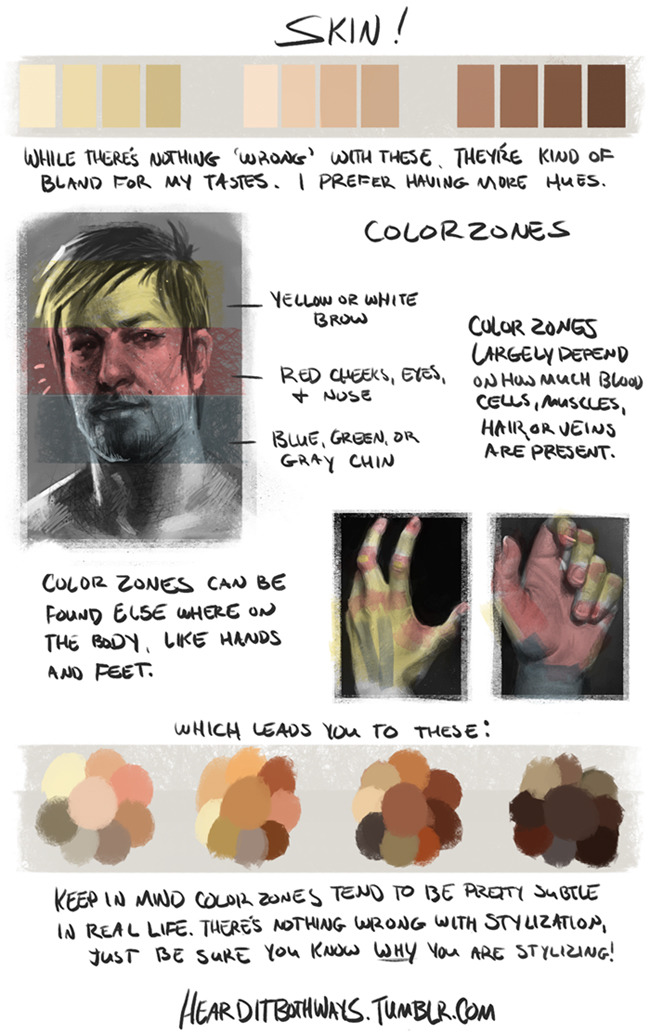
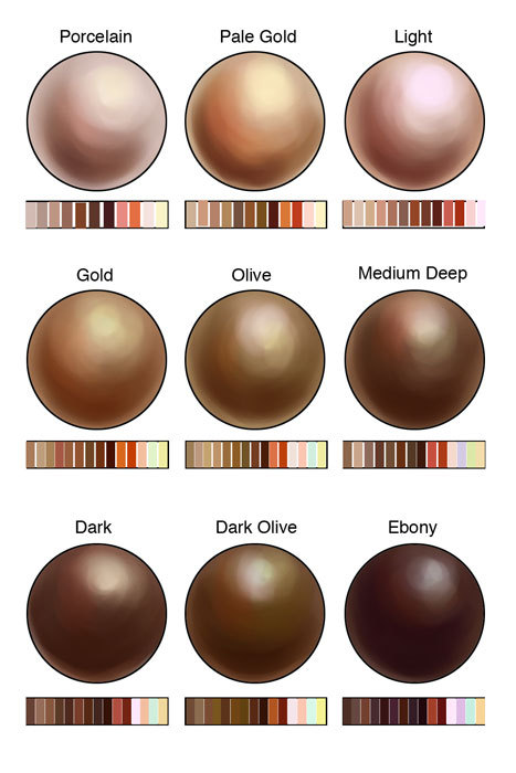
These might help you re: skin.

Posted Image

Posted Image

Also, here are two stock galleries I find very useful.
http://tigg-stock.de...rt.com/gallery/
http://syccas-stock....rt.com/gallery/

I don't think there are any specific armour examples in those, but when I'm designing armour I usually just google "(time period) armour" and reference from that. eg. I was redesigning the armour for an Assassin's Creed RP character, so I looked up Renaissance armour, templar armour, etc.

This post has been edited by Toraneko: 16 January 2013 - 02:34 AM

~ toranekostudios.tumblr.com ~
Stress causes baldness but if you pay too much attention to keeping your stress levels down
it'll stress you out even more so there's really nothing we can do about it after all.
1

#13 User is offline   High House Dark 

  • Gooseberry Extraordinaire
  • Group: Malaz Regular
  • Posts: 100
  • Joined: 13-January 13
  • Location:U.S.A.

Posted 16 January 2013 - 05:04 AM

View PostToraneko, on 16 January 2013 - 02:30 AM, said:

These might help you re: skin.


Also, here are two stock galleries I find very useful.
http://tigg-stock.de...rt.com/gallery/
http://syccas-stock....rt.com/gallery/

I don't think there are any specific armour examples in those, but when I'm designing armour I usually just google "(time period) armour" and reference from that. eg. I was redesigning the armour for an Assassin's Creed RP character, so I looked up Renaissance armour, templar armour, etc.


OMG THANK YOU. These are fantastic!!! And it's so hard to find a skin color tutorial/palette that goes dark enough too.
Currently re-reading the entire series and waiting for Fall of Light. You can catch me in the chat to win a drawing request!~MISANDRY FOR LIFE MUAHAHA~
0

#14 User is offline   Dolmen 2.0 

  • is probably lying
  • View gallery
  • Group: Malazan Artist
  • Posts: 2,692
  • Joined: 04-September 05
  • Location:Camorr
  • Interests:Walks in the park.

    Waiting till jean gets here.

Posted 16 January 2013 - 10:28 AM

Excellent start here, looking forward to see where you go with this. Lighting has alot to do with your skintoning, especially on more reflective darker toned skin. Before colouring this try work out what the environment is. Movie posters use a three point system, soft front light with a harsh back light to the back and left of your figure and soft ambient light to the right. Imagining where your light is and what hue it possesses can make a huge difference in the quality of your art, especially a fantasy piece like this. It sets a good mood. I can only assume you're going for something moody with sharp contrasts between background and foreground?

Edit: i quite like your armour. I think a few more trims about the collar and shoulder could help a little but I like it as is already.

This post has been edited by Dolmen+: 16 January 2013 - 10:32 AM

“Behind this mask there is more than just flesh. Beneath this mask there is an idea... and ideas are bulletproof Gas-Fireproof.”
1

#15 User is offline   Puck 

  • Mausetöter
  • Group: Malaz Regular
  • Posts: 1,927
  • Joined: 09-February 06
  • Location:Germany

Posted 16 January 2013 - 05:05 PM

I like it. It's heavily stylized, but in a good way (that's probably the first time I feel moved to say this in this forum). The armor is functional enough and I particularly like the face. It's probably not to everyone's liking, but it's got a soul, well done :lol:

Also, the colouring looks solid so far and the only danger I can see is overdoing it. With the drawing style it would probably be better to carefully block in lights and darks as opposed to trying to make it look more realistic. I feel the need to say that because of the tutorials Toraneko linked; they're good, but bear the danger of making one worry too much, which can be bad depending on the style you use.
Puck was not birthed, she was cleaved from a lava flow and shaped by a fierce god's hands. - [worry]
Ninja Puck, Ninja Puck, really doesn't give a fuck..? - [King Lear]
1

#16 User is offline   High House Dark 

  • Gooseberry Extraordinaire
  • Group: Malaz Regular
  • Posts: 100
  • Joined: 13-January 13
  • Location:U.S.A.

Posted 16 January 2013 - 09:27 PM

View PostDolmen+, on 16 January 2013 - 10:28 AM, said:

Excellent start here, looking forward to see where you go with this. Lighting has alot to do with your skintoning, especially on more reflective darker toned skin. Before colouring this try work out what the environment is. Movie posters use a three point system, soft front light with a harsh back light to the back and left of your figure and soft ambient light to the right. Imagining where your light is and what hue it possesses can make a huge difference in the quality of your art, especially a fantasy piece like this. It sets a good mood. I can only assume you're going for something moody with sharp contrasts between background and foreground?


Thank you!! And I started on a background, which is unusual for me since I have that horrible tendency to place characters in an ~endless white void of doom~ But I'm trying for that lighting you've suggested, cuz I like the idea of a movie-ish dramatic like quality.


View PostPuck, on 16 January 2013 - 05:05 PM, said:

Also, the colouring looks solid so far and the only danger I can see is overdoing it. With the drawing style it would probably be better to carefully block in lights and darks as opposed to trying to make it look more realistic. I feel the need to say that because of the tutorials Toraneko linked; they're good, but bear the danger of making one worry too much, which can be bad depending on the style you use.


I thought about cel-shading vs. some sort of pseudo-realism, but when I started playing around with the color of my lines, I liked the sort of realistic quality? Not sure if it will actually work out, but we'll see, haha.

Screenshot progress update, yay:

Attached File(s)


Currently re-reading the entire series and waiting for Fall of Light. You can catch me in the chat to win a drawing request!~MISANDRY FOR LIFE MUAHAHA~
1

#17 User is offline   Bugg's Construction 

  • Recruit
  • View gallery
  • Group: Malaz Regular
  • Posts: 16
  • Joined: 14-January 13

Posted 17 January 2013 - 12:38 AM

Wow I really like it. Contrast around the mouth is pretty much perfect.
“No sir. I judged as greatest the need of the Bridgeburners for the munitions in this carriage—’ ‘Shh! Don’t use that word, you fool!’ ‘Sorry, sir. Perhaps, then, we should invent some other term – something innocuous, that we could use freely.’ ‘Good idea. How about … kittens?’ ‘Kittens, sir? Why not? Now then, our carriage full of kittens is not something that can be abandoned, is it, sir?”

-The Crippled God
0

#18 User is offline   Dolmen 2.0 

  • is probably lying
  • View gallery
  • Group: Malazan Artist
  • Posts: 2,692
  • Joined: 04-September 05
  • Location:Camorr
  • Interests:Walks in the park.

    Waiting till jean gets here.

Posted 19 January 2013 - 10:16 AM

You see I lack the discipline to get my linework to such a crisp quality. The result you have is really clean which is awesome but you will notice all styles have a drawback. I think going for realism may be difficult with such stylized linework. The lighting from your left will workout alright but you need a sharp contrast light to get the result I mentioned. here have a look at this to see what I mean:

http://www.impawards..._city_ver5.html

Look at Bruce Willis and focus on how there is a white "line" on the right side (our right) of his face.

This will be hard to pull off with linework, as you will have a black outlineline and a sharp white light up against each other, Puck may be right in suggesting simple non-realistic cell shading instead of colour gradients. Its ultimately your call, I may add that a light brown light and background seems a good fit but maybe introduce a greenish blue counter-light from above? it could give a more positive impression of the environment and give you cool highlights for the sword handle.
“Behind this mask there is more than just flesh. Beneath this mask there is an idea... and ideas are bulletproof Gas-Fireproof.”
1

#19 User is offline   Bugg's Construction 

  • Recruit
  • View gallery
  • Group: Malaz Regular
  • Posts: 16
  • Joined: 14-January 13

Posted 19 January 2013 - 12:27 PM

A lot of comic book art today has pretty realistic gradient and shading while maintaining the traditional lines of the inker. Actually most of it. It's not really realistic but it looks cool.
“No sir. I judged as greatest the need of the Bridgeburners for the munitions in this carriage—’ ‘Shh! Don’t use that word, you fool!’ ‘Sorry, sir. Perhaps, then, we should invent some other term – something innocuous, that we could use freely.’ ‘Good idea. How about … kittens?’ ‘Kittens, sir? Why not? Now then, our carriage full of kittens is not something that can be abandoned, is it, sir?”

-The Crippled God
0

#20 User is offline   High House Dark 

  • Gooseberry Extraordinaire
  • Group: Malaz Regular
  • Posts: 100
  • Joined: 13-January 13
  • Location:U.S.A.

Posted 19 January 2013 - 05:43 PM

View PostDolmen+, on 19 January 2013 - 10:16 AM, said:

You see I lack the discipline to get my linework to such a crisp quality. The result you have is really clean which is awesome but you will notice all styles have a drawback. I think going for realism may be difficult with such stylized linework. The lighting from your left will workout alright but you need a sharp contrast light to get the result I mentioned. here have a look at this to see what I mean:

http://www.impawards..._city_ver5.html

Look at Bruce Willis and focus on how there is a white "line" on the right side (our right) of his face.

This will be hard to pull off with linework, as you will have a black outlineline and a sharp white light up against each other, Puck may be right in suggesting simple non-realistic cell shading instead of colour gradients. Its ultimately your call, I may add that a light brown light and background seems a good fit but maybe introduce a greenish blue counter-light from above? it could give a more positive impression of the environment and give you cool highlights for the sword handle.


Arrghgg, yeaah, I knew that would be a problem, and I understood what you were talking about (but I like the example, thanks!). My problem is I can't make up my mind, and I tend to default to linework before I realize that I want to go realistic. Which is then why I started to go back into my linework and color it. :\
I'll definitely add the counter-light - I'm so bad/inexperienced when it comes to backgrounds, so any help is awesome, haha.


View PostBugg, on 19 January 2013 - 12:27 PM, said:

A lot of comic book art today has pretty realistic gradient and shading while maintaining the traditional lines of the inker. Actually most of it. It's not really realistic but it looks cool.


Yeah, I'll probably go with that if I decide fiddling with my lines is getting too complicated. And it is.. but I'm stubborn, so it will be a while before I concede defeat.

Haven't been able to work on it lately, so update to come later today, hopefully.
Currently re-reading the entire series and waiting for Fall of Light. You can catch me in the chat to win a drawing request!~MISANDRY FOR LIFE MUAHAHA~
0

Share this topic:


  • 2 Pages +
  • 1
  • 2
  • You cannot start a new topic
  • You cannot reply to this topic

1 User(s) are reading this topic
0 members, 1 guests, 0 anonymous users