 Help
Help
An extract from PS Publishing's newsletter....
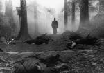
"And finally, in response to the many enquiries and inquiries (probably forty or fifty frantic fans of the fantastic), yes, PS will be publishing Ian Cameron Esslemonts new epic, BLOOD AND BONE. Itll be available in December (just in time for Santa to put one in his sack for you) in the now familiar two-book slipcased set, restricted to just 300 copies signed by Cam. Nicky is just starting work on the art choreswell show you them as soon as they start coming in."
Page 1 of 1
PS Publishing pre-announcement


#4
 Overactive Imagination
- High Fist
-

- Group: Malaz Regular
- Posts: 314
- Joined: 22-September 12
Posted 19 January 2013 - 10:23 AM
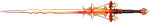
Those covers suck imo. Looks like they spent a whole 10 seconds choosing a font type. I like the TOR/Bantam one more.
#5
Anomander Morg

- Recruit
-
- Group: Malaz Regular
- Posts: 13
- Joined: 24-January 12
Posted 23 January 2013 - 08:03 AM
Not like PS to be late..............
Think this might be the first one I pass on, having read it on the kindle and not seeing the need for these collector's editions as they are no longer the first issue. Good as they normally look, the plain slipcases are pretty awful.
Think this might be the first one I pass on, having read it on the kindle and not seeing the need for these collector's editions as they are no longer the first issue. Good as they normally look, the plain slipcases are pretty awful.
#6
Tattersail_

- formerly Ganoes Paran
-
- Group: High House Mafia
- Posts: 13,245
- Joined: 16-July 10
- Location:Wirral
-
Interests:Mafia. Awesome Pictures. Awesome Videos. Did I mention Mafia?
snapchat - rustyspoon84
Posted 23 January 2013 - 09:16 AM
Cool, I have nothing to read so this is good.
Apt is the only one who reads this. Apt is nice.
#7
Khellendros
- Saboteur of High House Mafia
-
- Group: High House Mafia
- Posts: 7,298
- Joined: 14-August 07
Posted 23 January 2013 - 04:45 PM
Those covers are better, in my opinion, then the fairly generic Tor/Bantam one. They're both directly relevant to the plot too, which is always a nice thing for a cover.
Good, but not great
Good, but not great
"I think I've made a terrible error of judgement."
#9
Salt-Man Z

- My pen halts, though I do not
-

- Group: Malaz Regular
- Posts: 4,160
- Joined: 07-February 08
- Location:Apple Valley, MN
Posted 23 January 2013 - 10:57 PM
I like 'em.
They're certainly better than Steve Stone's recent hackwork.
They're certainly better than Steve Stone's recent hackwork.
"Here is light. You will say that it is not a living entity, but you miss the point that it is more, not less. Without occupying space, it fills the universe. It nourishes everything, yet itself feeds upon destruction. We claim to control it, but does it not perhaps cultivate us as a source of food? May it not be that all wood grows so that it can be set ablaze, and that men and women are born to kindle fires?"
―Gene Wolfe, The Citadel of the Autarch
―Gene Wolfe, The Citadel of the Autarch
#10
Defiance

- Vicariously I live while the whole world dies
-
- Group: Malaz Regular
- Posts: 1,472
- Joined: 24-December 09
- Location:IA
- Interests:Malazan, RPGs, writing
Posted 24 January 2013 - 12:37 AM
I'm indifferent concerning the covers - at least they're better than the regular book's - but good god, who the fuck chose that font? That is hideous.
uhm, that should be 'stuff.' My stiff is never nihilistic.
~Steven Erikson
Mythwood: Play-by-post RP board.
~Steven Erikson
Mythwood: Play-by-post RP board.

#12
Salt-Man Z
- My pen halts, though I do not
-
- Group: Malaz Regular
- Posts: 4,160
- Joined: 07-February 08
- Location:Apple Valley, MN
Posted 24 January 2013 - 05:05 PM
String 'im up, boys.
"Here is light. You will say that it is not a living entity, but you miss the point that it is more, not less. Without occupying space, it fills the universe. It nourishes everything, yet itself feeds upon destruction. We claim to control it, but does it not perhaps cultivate us as a source of food? May it not be that all wood grows so that it can be set ablaze, and that men and women are born to kindle fires?"
―Gene Wolfe, The Citadel of the Autarch
―Gene Wolfe, The Citadel of the Autarch
Share this topic:


Page 1 of 1