After striking some funny poses I realized I'm not as limber as Korra (and not sure actually how high one might raise their leg in that position...) so that's as much as I got out of her. Remember that the body rotates and that affects the placement of the hips. The arms would require a fair deal of foreshortening (a suggestion drawn in), also her legs should be a mite longer.
Now, Kita:
1: Head: she's tilting it forwards. The nostrils would not be visible; lower her nose/eyes a bit.
2. Her breasts are too high up. Unless she has implants or firm support/corset, their outlines will not show past the armpits. My suggestion is in "cold weather mode", so one might still lower them a bit from that.
3. Lower the collarbones.
4 Push her hips "forwards". Typical for women, also they have more fat layer in the stomach area than men to protect various reproductive functions.
Hope that helps! :-D
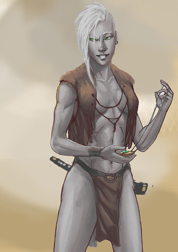
 dolmencrit10.jpg (278.8K)
Number of downloads: 0
dolmencrit11.jpg (185.75K)
Number of downloads: 0
dolmencrit10.jpg (278.8K)
Number of downloads: 0
dolmencrit11.jpg (185.75K)
Number of downloads: 0
 Help
Help


 Have attempted to resume painting here in the bottom of the abyss after several years, however. Would anyone have time for a redline if I uploaded something?