Malazan Empire: Coltaine redo - Malazan Empire

Jump to content

Page 1 of 1
  • You cannot start a new topic
  • You cannot reply to this topic

Coltaine redo I totally blame epilogue.net

#1 User is offline   Onrack 

  • Captain
  • Group: Malazan Artist
  • Posts: 157
  • Joined: 10-April 08
  • Location:wales

Posted 27 October 2008 - 03:09 PM

ahoy! I tried to post the original picture on the epilogue site but it was turned down because it wasn't good enough needless to say this twisted my tits real sore so I decided to get on the case of making it good enough, it was a long and arduous journey and I learned a great many things foremost how much I hate horses, anyhow i'll do a before and after thing cuz I love a bit of cheesiness
before
Posted Image
a long long time after
Posted Image
here's a link to the forum where I worked thought he image there's a whole heap of awesome advice in here and judging by how strict they are on submissions there may be plenty more
http://www.epilogue....pic.php?t=21264
0

#2 User is offline   teholbeddict 

  • Drinking Queen of the Abyssmal Army!!!
  • View gallery
  • Group: The Abyssmal Army
  • Posts: 1,344
  • Joined: 22-October 08
  • Location:Winnipeg MB Canada

Posted 27 October 2008 - 09:26 PM

Wow! Ok I know nothing about art to start with and reading through those posts and suggesstions I realize I really know nothing about art. Either way I really liked the fourth revision that you did, the one where you completely re-worked the horse's head. Funnily enough I like that horse much better that the final one. Overall much better that anything I could ever hope to do and for what it's worth I think you have tremendous talent.
Procrastination is like masturbation, you're only F ing yourself...
-Bubbalicious -

Human progress is neither automatic nor inevitable… Every step toward the goal of justice requires sacrifice, suffering, and struggle; the tireless exertions and passionate concern of dedicated individuals.
- Martin Luther King, Jr-

The only thing one can learn from one's past mistakes is how to repeat them exactly.
-Stone Monkey-

Muffins are just ugly cupcakes!
-Zanth13-
0

#3 User is offline   D'rek 

  • Consort of High House Mafia
  • Group: Super Moderators
  • Posts: 14,599
  • Joined: 08-August 07
  • Location::

Posted 28 October 2008 - 02:16 AM

Wow, those epilogue folks are hardcore...

But you'll always be welcome here, Onrack, because we looooooooove you!!!

Edit: A big huggy bunch!

This post has been edited by D'rek: 28 October 2008 - 02:16 AM

View Postworrywort, on 14 September 2012 - 08:07 PM, said:

I kinda love it when D'rek unleashes her nerd wrath, as I knew she would here. Sorry innocent bystanders, but someone's gotta be the kindling.
0

#4 User is offline   Osric 

  • Captain
  • Group: Malaz Regular
  • Posts: 190
  • Joined: 02-October 08
  • Location:Holland
  • Interests:Books, Games, Programming, Beer, Women, Movies

Posted 29 October 2008 - 12:58 PM

I know not about art, but I do know that is awesome. :(
Wise words are like arrows flung at your forehead. What do you do? Why, you duck of course.
-Bult
0

#5 User is offline   Ain't_It_Just_ 

  • The Recidivist
  • Group: LHTEC
  • Posts: 2,369
  • Joined: 17-January 08
  • Location:Oz
  • Interests:Dungeons and Dragons, and the odd caramel slice.
  • The AIJman cometh

Posted 03 November 2008 - 10:14 AM

Yeah, I prefer the first one...but great stuff On!
Suck it Errant!


"It's time to kick ass and chew bubblegum...and I'm all out of gum."

QUOTE (KeithF @ Jun 30 2009, 09:49 AM) <{POST_SNAPBACK}>
It has been proven beyond all reasonable doubt that the most powerful force on Wu is a bunch of messed-up Malazans with Moranth munitions.


0

#6 User is offline   SilentHunter 

  • I hate silence!!
  • Group: Malaz Regular
  • Posts: 61
  • Joined: 22-June 08
  • Location:India

Posted 05 November 2008 - 05:48 PM

Amazing stuff!!.......................keep up the gr8 work!
0

#7 User is offline   WWQBD? 

  • Recruit
  • Group: Malaz Regular
  • Posts: 26
  • Joined: 12-November 08
  • Location:Holland, MI
  • Interests:Crafting, reading, writing, math, etc.
  • Kookooka-freakin-choo.

Posted 13 November 2008 - 10:11 AM

Coltaine!!!!

Sugoi!
"As it turns out, the author is the most fickle of gods." -Me
0

#8 User is offline   Grimjust Bearegular 

  • Irregular Bacon Berserker Medic of the Abyssmal Army
  • View gallery
  • Group: Malazan Artist
  • Posts: 1,638
  • Joined: 20-July 06
  • Location:Vault 101
  • Interests:MAFIA, drawing and writing.
  • Godless killing machine - and proud of it!

    Also, braaaaiiiinnnnzzzzzzzz!

Posted 17 December 2008 - 02:57 PM

I can't believe Epilogue turned You down....now, there's really not much hope for the rest of us:P
Things and stuffs...and other important objects.
0

#9 User is offline   Bauchelain the Evil 

  • Greatest necromancer ever
  • Group: Team Quick Ben
  • Posts: 1,859
  • Joined: 15-March 08
  • Location:Italy
  • Not much

Posted 17 December 2008 - 04:30 PM

I prefered the first one but I'm not really what you would call an art genious :D
Adept of Team Quick Ben

I greet you as guests and so will not crush the life from you and devour your soul with peals of laughter. No, instead, I will make tea-Gothos
0

#10 User is offline   Argent Sun 

  • Shield Anvil
  • Group: Malaz Regular
  • Posts: 7
  • Joined: 24-November 08
  • Location:Chicago

Posted 03 January 2009 - 12:32 AM

I still like the old version better. Coltaine isn't as clear there, which I think is something Erikson himself does - not describing the character's physical appearance, that is. Moreover he looks kind of more heroic there, in my opinion. The newer version, albeit more vivid and detailed...*shrug*.
I don't know. I like the first one better.
A single regret can crush a thousand proud deeds.
0

#11 User is offline   Blend 

  • Gentleman of High House Mafia
  • View gallery
  • Group: High House Mafia
  • Posts: 4,579
  • Joined: 28-March 03
  • Location:Ottawa

Posted 20 January 2009 - 05:26 PM

View PostArgent Sun, on Jan 3 2009, 12:32 AM, said:

I still like the old version better. Coltaine isn't as clear there, which I think is something Erikson himself does - not describing the character's physical appearance, that is. Moreover he looks kind of more heroic there, in my opinion. The newer version, albeit more vivid and detailed...*shrug*.
I don't know. I like the first one better.


I agree, there's something about the first version that really conveys the style that Erikson writes in. Dirty, gritty, loose around the edges... I think those epilogue folk are on crack. The second one is good, but I think it's too, I dunno, American MBotF cover compared to UK MBotF cover. I'd much rather see the first on a cover than the second.
There is no struggle too vast, no odds too overwhelming, for even should we fail - should we fall - we will know that we have lived. ~ Anomander Rake
My sig comes from a game in which I didn't heed Blend's advice. So maybe this time I should. ~ Khellendros
I'm just going to have to come to terms with the fact that self-vote suiciding will forever be referred to as "pulling a JPK" now, aren't I? ~ JPK
0

#12 User is offline   Onrack 

  • Captain
  • Group: Malazan Artist
  • Posts: 157
  • Joined: 10-April 08
  • Location:wales

Posted 22 January 2009 - 09:55 PM

well well well! it seems I wasn't actually finished with this pic after all (it was news to me) I finally finished off the second pic then thought bugger it I'll have another go at the original so here they are........again.......for the last time..........maybe!
Posted Image
Posted Image
0

#13 User is offline   Grief 

  • Prophet of High House Mafia
  • Group: Administrators
  • Posts: 2,267
  • Joined: 11-July 08

Posted 22 January 2009 - 10:21 PM

Redo of original is awesome, though for some reason I think I prefer the facial expression of the first.
Seems more gritty/determined, or something, as opposed to wild.

The helmet in pic 1 seems to still draw the eye, which im not sure if its meant to or what, being a non-artist. However, i'd say its not a great thing, as it seems to draw the eye to the bottom right, which is away from the fantastic sword and person who's been sliced.

I love the rising background figure on the horse, and the background fighting/ruin generally.

Great work :p

Cougar said:

Grief, FFS will you do something with your sig, it's bloody awful


worry said:

Grief is right (until we abolish capitalism).
0

#14 User is offline   Salt-Man Z 

  • My pen halts, though I do not
  • View gallery
  • Group: Malaz Regular
  • Posts: 4,159
  • Joined: 07-February 08
  • Location:Apple Valley, MN

Posted 22 January 2009 - 10:59 PM

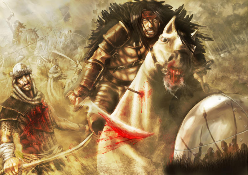
I never did care for the second version. It just lacked the dynamism of the first. (Also: the horse looked bizarre, the enemy soldier's pose was wooden, the feather cloak was distracting, and the level of detail throughout the pic felt inconsistent.)

The third version is based on the first, which I love. But the horse's face has been much improved, and the repositioning of the foreground soldier works far better. Coltaine's new expression is done well, but I find I prefer the more passionless expression from the original. The one thing that bugs me about this third version is the increased smoke, which, while it looks very nice behind Coltaine (and softens his cloak nicely) is just distracting where it overlays the foreground soldier, making him looking even sketchier than he already does.
"Here is light. You will say that it is not a living entity, but you miss the point that it is more, not less. Without occupying space, it fills the universe. It nourishes everything, yet itself feeds upon destruction. We claim to control it, but does it not perhaps cultivate us as a source of food? May it not be that all wood grows so that it can be set ablaze, and that men and women are born to kindle fires?"
―Gene Wolfe, The Citadel of the Autarch
0

#15 User is offline   Onrack 

  • Captain
  • Group: Malazan Artist
  • Posts: 157
  • Joined: 10-April 08
  • Location:wales

Posted 23 January 2009 - 11:40 AM

I know what you mean about the increased smoke (it was supposed to be subtle lighting) the picture reads a lot differently from the computer I done it on to the one I'm currently on the net with, which has a tendency to undersaturate pictures but I took the "lighting" out anyway and over contrasted it on my computer so it should read better on this one, as for the face the old one just couldn't cut it in terms of anatomy, expression and detail for what I wanted for the pics' violence and tension and his mouth made him look like Stallone, here's the improved version
Posted Image
0

#16 User is offline   Assail 

  • Destriant of the Abyssmal Army
  • Group: The Abyssmal Army
  • Posts: 820
  • Joined: 25-March 09
  • Location:Kaneohe Bay, HI

Posted 25 March 2009 - 09:30 PM

I don't know too much about art, I loved both pictures. However, I felt you very much captured the ferocity of the horse in the first picture, whereas in the second you didn't so much. The second horse seemed to have eyes that didn't quite match the ferocity of the first horses. If you get what I'm saying haha.
I still heart Goodkind.
0

#17 User is offline   Quick~ 

  • Fist
  • Group: Malazan Artist
  • Posts: 257
  • Joined: 16-January 08

Posted 26 March 2009 - 12:02 AM

The redo of the original is the best of the lot imo, though I prefer the expression on the original itself, the closed mouth just gave him an air that was a bit more certain in his purpose.

the 2nd version just seems a bit odd to me, the expressions are somewhat strange and I'm not feeling the composition as much (though the introduction of more background elements was nice). The Taine and his horse also seem a little over-saturated given there's very little difference in the atmospheric perspective, it just sort of jumps from Taine and his foe straight to obscured BG elements.
0

Share this topic:


Page 1 of 1
  • You cannot start a new topic
  • You cannot reply to this topic

1 User(s) are reading this topic
0 members, 1 guests, 0 anonymous users