Malazan Empire: Big Malazan Digital Art Project - Malazan Empire

Jump to content

  • 2 Pages +
  • 1
  • 2
  • You cannot start a new topic
  • You cannot reply to this topic

Big Malazan Digital Art Project

#1 User is offline   Araiel 

  • Recruit
  • Group: Malaz Regular
  • Posts: 14
  • Joined: 03-October 13
  • Location:Garwolin, Poland
  • Interests:singing, drawing, photography, history (Ancient history, Middle Ages), Japanese culture, D&D, books (fantasy, thrillers, horrors), Magic: The Gathering, VFX, Game and Film Industry, digital art

Posted 07 June 2016 - 07:10 AM

Hello everyone,

I would like to start a topic in which I will post all my digital works connected with Malazan universe. I hope it will be a big project and after some time there will be a lot of concepts, 3d models and illustrations. As a big fan of Peter Jackson's movie creation of Middle-Earth I'd like to make something similar for Malaz – I know, it's ambitious target but I have a time and patience. So who knows, maybe I will be able to do that. If everything will go ok, I would think also about collaboration with other artist to speed up the whole process.

Here is my actual portfolio – so you can see the actual level of my works: My portfolio - www.lukaszliszko.com . In Malazan Project I start from small assets and then move to some bigger ones and at the end to full characters illustrations.
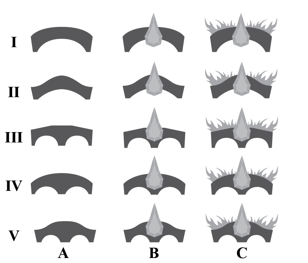
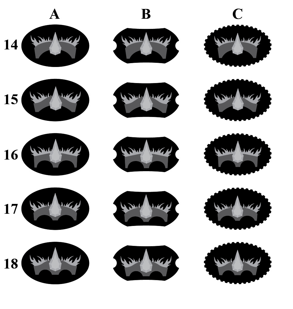
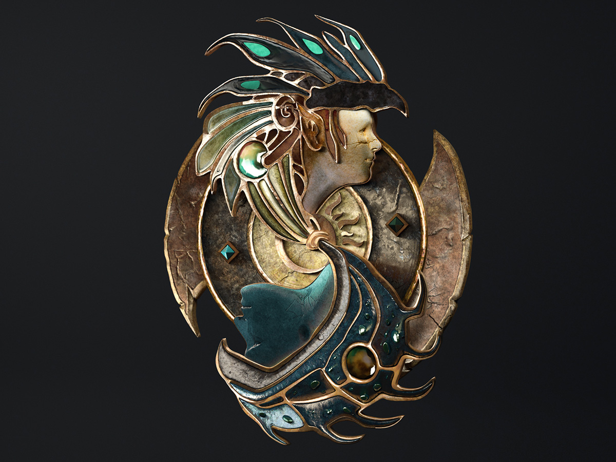
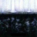
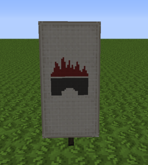
So, first model will be a Bridgeburners brooch which was mentioned at the beginning of "Gardens of the Moon". Below are some silhouettes/concepts – I hope you can help me choose the best one or make a better version. Then I will model this in 3d and try to make it similar to Baldur's Gate 2 logo from my portfolio (image at the end of the post). All criticism, comments and suggestions are welcome :p

Posted Image


Posted Image


Posted Image


Posted Image


Posted Image

Posted Image

This post has been edited by Araiel: 07 June 2016 - 07:11 AM

8

#2 User is offline   Tsundoku 

  • A what?
  • Group: Malaz Regular
  • Posts: 4,657
  • Joined: 06-January 03
  • Location:Maison de merde

Posted 07 June 2016 - 07:22 AM

Welcome. Nice BG image.

My inclination is 6A or 7A, thanks.

I'm also quite fond of these images as well, if you want to have fun with them. If anyone does tshirt printing I'd love to see one with the claw symbol on the left breast and the full shield with motto on the back.

Attached File(s)


This post has been edited by Tsundoku: 07 June 2016 - 07:24 AM

"Fortune favors the bold, though statistics favor the cautious." - Indomitable Courteous (Icy) Fist, The Palace Job - Patrick Weekes

"Well well well ... if it ain't The Invisible C**t." - Billy Butcher, The Boys

"I have strong views about not tempting providence and, as a wise man once said, the difference between luck and a wheelbarrow is, luck doesn’t work if you push it." - Colonel Orhan, Sixteen Ways to Defend a Walled City - KJ Parker
0

#3 User is offline   Araiel 

  • Recruit
  • Group: Malaz Regular
  • Posts: 14
  • Joined: 03-October 13
  • Location:Garwolin, Poland
  • Interests:singing, drawing, photography, history (Ancient history, Middle Ages), Japanese culture, D&D, books (fantasy, thrillers, horrors), Magic: The Gathering, VFX, Game and Film Industry, digital art

Posted 07 June 2016 - 07:34 AM

Tsundoku, thanks - I hope Bridgeburners brooch will look even better than BG logo ;) Also thanks for the images you attached and for writing your favourite options. I will wait a bit - maybe someone else also write his opinion and then I start making 3d model. Of course I will add some ornaments, frames and sculpt to the final look to make it more eye-pleasing :p
0

#4 User is offline   worry 

  • Master of the Deck
  • Group: Malaz Regular
  • Posts: 14,577
  • Joined: 24-February 10
  • Location:the buried west

Posted 07 June 2016 - 07:43 AM

I don't have a specific favorite, and I think most of the designs are pretty cool, but if you are taking advice -- and this doesn't sound too daunting/impractical in terms of detail-work -- I would suggest you emphasize the brickwork of the bridge a bit. I say that because for some of these designs the bridge w/ flames actually resembles a crown. I recognize you called these silhouettes so maybe you already had this idea. I do have a favorite background shape from the second card, and it's 2A.
They came with white hands and left with red hands.
0

#5 User is offline   Araiel 

  • Recruit
  • Group: Malaz Regular
  • Posts: 14
  • Joined: 03-October 13
  • Location:Garwolin, Poland
  • Interests:singing, drawing, photography, history (Ancient history, Middle Ages), Japanese culture, D&D, books (fantasy, thrillers, horrors), Magic: The Gathering, VFX, Game and Film Industry, digital art

Posted 07 June 2016 - 07:56 AM

worry said:

I would suggest you emphasize the brickwork of the bridge a bit.

Yes, I have this in my plans. All details will be added during sculpting in 3d :p Also thanks for choosing the favourite background shape.
0

#6 User is offline   Tsundoku 

  • A what?
  • Group: Malaz Regular
  • Posts: 4,657
  • Joined: 06-January 03
  • Location:Maison de merde

Posted 07 June 2016 - 08:09 AM

Hmmm, good point Worry. I could live with 11A or 12A too. :p

@Araiel
Love the various lightsabre hilts on your site. Princess Leia dresses a little ... differently from what I remember. ;)

This post has been edited by Tsundoku: 07 June 2016 - 08:14 AM

"Fortune favors the bold, though statistics favor the cautious." - Indomitable Courteous (Icy) Fist, The Palace Job - Patrick Weekes

"Well well well ... if it ain't The Invisible C**t." - Billy Butcher, The Boys

"I have strong views about not tempting providence and, as a wise man once said, the difference between luck and a wheelbarrow is, luck doesn’t work if you push it." - Colonel Orhan, Sixteen Ways to Defend a Walled City - KJ Parker
0

#7 User is offline   Araiel 

  • Recruit
  • Group: Malaz Regular
  • Posts: 14
  • Joined: 03-October 13
  • Location:Garwolin, Poland
  • Interests:singing, drawing, photography, history (Ancient history, Middle Ages), Japanese culture, D&D, books (fantasy, thrillers, horrors), Magic: The Gathering, VFX, Game and Film Industry, digital art

Posted 07 June 2016 - 08:38 AM

So we have 2 votes on 11A/12A (I will count Worry vote here) and 1 vote for 6A/7A.

Tsundoku, I'm glad that you like lightsabers ;) As you can see I'm also a big fan of the Star Wars and for Princess Leia I've decided to make some redesign :p

Ps. Simultaneously to this first brooch project I reread the whole series. I'm after "Garden of the Moon" and I've gathered all references/descriptions from it. Now I'm rereading "Deadhouse Gates" and try to put all info from the first book in order.
0

#8 User is offline   Coltaine - 

  • First Sword
  • Group: Malaz Regular
  • Posts: 621
  • Joined: 01-March 16
  • Location:Germany

Posted 07 June 2016 - 08:57 AM

I like the bridge model V the most. Background is more difficult. Maybe 2B or 3B

Thanks for asking. Great idea. :p
0

#9 User is offline   Araiel 

  • Recruit
  • Group: Malaz Regular
  • Posts: 14
  • Joined: 03-October 13
  • Location:Garwolin, Poland
  • Interests:singing, drawing, photography, history (Ancient history, Middle Ages), Japanese culture, D&D, books (fantasy, thrillers, horrors), Magic: The Gathering, VFX, Game and Film Industry, digital art

Posted 07 June 2016 - 10:27 AM

Coltaine93, thanks.

Votes:
2x - 11A/12A/13B (two on 13B because I've added here mine vote, too)
1x - 6A/7A/18B
0

#10 User is offline   Itwęs Nom 

  • Inquisitor of High House Mafia
  • Group: High House Mafia
  • Posts: 1,535
  • Joined: 02-August 15

Posted 07 June 2016 - 06:26 PM

I like 9,10,14,15 B the best, I think the the bridges without supporting pillars suit better the purpose because they could signify there's endless abyss underneath which goes better with the overall meaning of the whole burning bridges concept

also you can make a this thread include a poll if you want

Awesome project!

This post has been edited by Itwęs Nom: 07 June 2016 - 07:09 PM

All things fall from kings to rose petals
0

#11 User is offline   misteradam 

  • Paint Sniffer
  • View gallery
  • Group: Malaz Regular
  • Posts: 61
  • Joined: 04-March 14
  • Location:NY, USA

Posted 07 June 2016 - 06:31 PM

Awesome! I like 14/16/17A the most. I would play around with the flame shapes and gem shape/sizes a little to keep it away from crown territory. Thanks for posting, looking forward to see what you come up with!
0

#12 User is offline   Araiel 

  • Recruit
  • Group: Malaz Regular
  • Posts: 14
  • Joined: 03-October 13
  • Location:Garwolin, Poland
  • Interests:singing, drawing, photography, history (Ancient history, Middle Ages), Japanese culture, D&D, books (fantasy, thrillers, horrors), Magic: The Gathering, VFX, Game and Film Industry, digital art

Posted 07 June 2016 - 08:13 PM

Thanks so much everyone for your feedback. It's great when you see that other people are interested in what you create. That's really motivating :p
Itwęs Nom, interesting view on the pillars. I'll think about that.
misteradam, I'll try to do some tests with another gem shape in my free time.

Votes - so I see that I will choose from A and B shapes for the background. Later I will see which bridge shape will be choosen the most and combine these two results.
2x - 11A/12A/13B
1x - 6, 7, 14, 16, 17 ( A )
1x - 9, 10, 14, 15, 18 ( B )
0

#13 User is offline   Dadding 

  • Shaved Knuckle in the Hole
  • Group: Malaz Regular
  • Posts: 365
  • Joined: 27-August 13
  • Location:Vancouver, British Columbia

Posted 09 June 2016 - 02:05 PM

18B is my personal favourite. But they're all wonderful!

I have an ongoing project designing Darujhistan in the video game Minecraft, and I'd love to use one of these as a painting / banner in-game if you'd allow it. The silhouette style lends itself well to in-game art and would be a lot nicer than my first clumsy attempt. You'd be credited of course, if I ever get around to finishing / releasing it!
1

#14 User is offline   Gorefest 

  • Witness
  • Group: Malaz Regular
  • Posts: 2,982
  • Joined: 29-May 14
  • Location:Sheffield

Posted 09 June 2016 - 02:40 PM

Are you going for a realisitc sigil depiction or a decorative brooch in the spirit of the books? Because I cannot recall there being mention of a big jewel in the centre of the sigil.

A few references:
"A silver brooch; a bridge of stone, lit by ruby flames."

"An arched bridge a background of licking flames."

"They were of a kind, then
the histories writ large
in tattooed tracery
the tales a tracking
of old wounds
but something glowed hard
in their eyes – those
flame-gnawed arches,
that vanishing span
,
they are their own past
each in turn destined
to fall in line
on the quiet wayside
beside the river
they refuse to name . . ."

Although I like Itwaes Nom's reasoning, Toc's poem would suggest that there are arches to the bridge instead of it being a continuous span. Although most artist representations that I have seen of the emblem so far (like the ones listed above by Tsundoku) all go for a single span. I appreciate that the jewel in the centre of your concepts is a nice focal point for a decorative brooch, but if you are going for the 'sticking to the books' realism angle I would leave it out.

This post has been edited by Gorefest: 09 June 2016 - 02:43 PM

Yesterday, upon the stair, I saw a man who wasn't there. He wasn't there again today. Oh, how I wish he'd go away.
0

#15 User is offline   Araiel 

  • Recruit
  • Group: Malaz Regular
  • Posts: 14
  • Joined: 03-October 13
  • Location:Garwolin, Poland
  • Interests:singing, drawing, photography, history (Ancient history, Middle Ages), Japanese culture, D&D, books (fantasy, thrillers, horrors), Magic: The Gathering, VFX, Game and Film Industry, digital art

Posted 12 June 2016 - 11:51 AM

Dadding, of course you can use them in your Darujhistan project. I'm happy that you like these designs :)

Gorefest, I was thinking about "sticking to the books" and after watching all making-ofs from "The Lord of the Rings" and "Hobbit" I think that some changes are necessary to make it more suitable for visual creation. Some things clearly need some changes to make them more eye-pleasing and I think that this jewel in the centre would be nice addition to the whole design.

Btw, I've started to make 3d model of the brooch. I would try to post some images today late in the night or tomorrow.
2

#16 User is offline   Araiel 

  • Recruit
  • Group: Malaz Regular
  • Posts: 14
  • Joined: 03-October 13
  • Location:Garwolin, Poland
  • Interests:singing, drawing, photography, history (Ancient history, Middle Ages), Japanese culture, D&D, books (fantasy, thrillers, horrors), Magic: The Gathering, VFX, Game and Film Industry, digital art

Posted 13 June 2016 - 08:55 PM

Alpha version of the 3d model

Attached File(s)

  • Attached File  01.jpg (105.77K)
    Number of downloads: 2

6

#17 User is offline   Gorefest 

  • Witness
  • Group: Malaz Regular
  • Posts: 2,982
  • Joined: 29-May 14
  • Location:Sheffield

Posted 16 June 2016 - 11:33 AM

I must say that looks really awesome. Still not sure about the jewel though, I feel it takes away from the 'emblem' feel of the sigil. But of course I'm not a graphic designer so I won't argue with your rationale there :) 
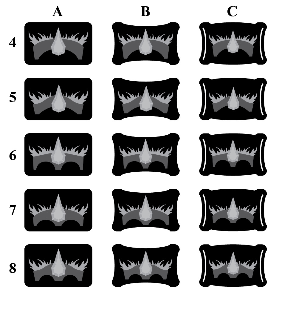
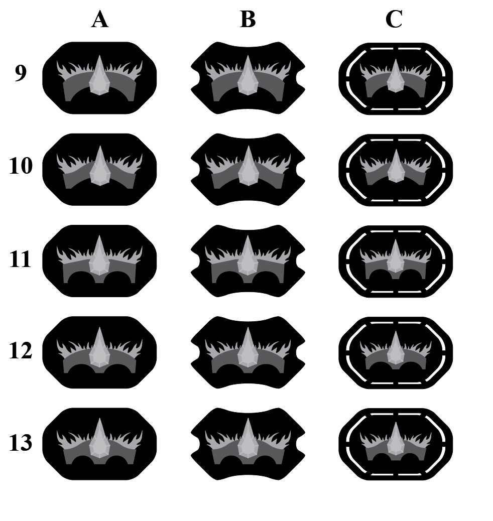
I really like the background design.

I would echo Worry's previous comment and add some sort of brickwork motif to the bridge itself, to make sure it doesn't get mistaken for a crown. But I think you already said that was the plan. Great work.
Yesterday, upon the stair, I saw a man who wasn't there. He wasn't there again today. Oh, how I wish he'd go away.
0

#18 User is offline   Itwęs Nom 

  • Inquisitor of High House Mafia
  • Group: High House Mafia
  • Posts: 1,535
  • Joined: 02-August 15

Posted 16 June 2016 - 11:51 AM

I agree about the jewel with Gore, when I saw your preliminary sifils I thought it was mentioned somewhere thourghout the books that the jewel was there but I missed/forgot it

I think it takes too much attention to itself and leaves burning bridge a bit more in the background

But it looks awesome!
All things fall from kings to rose petals
0

#19 User is offline   worry 

  • Master of the Deck
  • Group: Malaz Regular
  • Posts: 14,577
  • Joined: 24-February 10
  • Location:the buried west

Posted 16 June 2016 - 08:28 PM

Are you sure it's a jewel? It might just be a comma.
They came with white hands and left with red hands.
0

#20 User is offline   Araiel 

  • Recruit
  • Group: Malaz Regular
  • Posts: 14
  • Joined: 03-October 13
  • Location:Garwolin, Poland
  • Interests:singing, drawing, photography, history (Ancient history, Middle Ages), Japanese culture, D&D, books (fantasy, thrillers, horrors), Magic: The Gathering, VFX, Game and Film Industry, digital art

Posted 17 June 2016 - 07:09 AM

About jewel, I would like to stay with it :)

I have free time mainly during the weekend so next update will be on Sunday's night. Brickwork on the bridge will be of course added. I hope everything will be more visual clear when I finish sculpting and start making textures/materials.
0

Share this topic:


  • 2 Pages +
  • 1
  • 2
  • You cannot start a new topic
  • You cannot reply to this topic

1 User(s) are reading this topic
0 members, 1 guests, 0 anonymous users