Help
Help


But this is my failing. Basically my imagination flagrantly disregarding Erikson's text.
A note on covers:
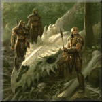
I'm a professional copyeditor, of sorts, and am studying editing and book publishing as a whole. One thing I learned fairly quickly was that authors and creators have ZERO say on the cover 100% of the time. You would think after selling a bazillion books, Robert Jordan could say "Hey, let's not totally ruin the cover this time," but no, he can't, and nor can Erikson interfere with what is solely considered a duty of the publisher. The cover is not part of the story, it's a tool to sell books, and since selling books is hard, you can imagine the importance of hooking casual readers with visuals. Now, I always barf when I see generic fantasy covers, so sometimes I don't understand what publishers are smoking when they choose SHEE-NA, THE DRAGON-LADY SLAYER OF THE FIFTH WIND, SWORDBREAKER or some such - with a hugely busty long-haired woman wearing steel undergarments fighting a lizard man wielding a gun and riding a werewolf. These don't appeal to me, nor any of you, I'd imagine. But that's just the way covers are. So don't worry too much about if the hounds look like wolves - just try to be better than me by imagining them as hounds and disregard the bad-ass wolf on the cover of Toll the Hounds.
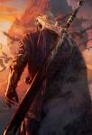
I think Erikson got kinda lucky, even. Some covers are wicked awesome, especially the mostly dark (TOR?) ones. Reaper's Gale is my favourite.
But it shows the power the artist has: a generic and awful cover can make even Whiskeyjack look like some jerk on a hill.
This post has been edited by Tatterdemalion: 16 December 2009 - 12:49 AM


 I agree with you, I think enormous wolves is more badass than enormous dogs. They seem faster and more agressive....and I think you are thinking of the Bantam covers. The TOR covers, though some are still cool in my opinion, they're usually closer to the generic goofy fantasy covers of most other books.